Hello! (New Color Pallete)
The team and I have made substantial progress since December of 2017! What started as a proof-of-concept made for a 3-day competition is now the skeleton of a professional product cobblestoned together. In six months, about half of the main mechanics have been added to the game, including a:
- Save/ load system
- Four-layered, 2D level grid
- Dynamic text log
- Full player movement
These wouldn't be enough mechanics to build a good NES game, but nonetheless, Phantomatics is starting to take form. The current demo has all the bare minimum: Graphics, Music, Puzzles, Platforming, Story, and Controls. Though some of the music and graphics need work, we've put a lot of time and polish into the presentation of what we have so far! As an example, we recently decided to subtly personalize the color palette. We were using a traditional 16 color RGB palette:
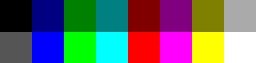
Many computer games in the early 90s relied on these exact 16 colors, but the difference is, they generally could only have a tiny handful of colors per sprite. We decided to forgo that limitation as a stylistic choice. If you squint at the colors above, it actually looks like 8 colors instead of 16, which basically means half of color palette could be removed and it wouldn't make a huge difference. In essence, we were only working with 8 colors and that was putting a huge strain on making sprites detailed. Furthermore, Phantomatics depicts a dead future when an unbearable heat will bleached the whole surface of the Earth, and so my team and I decided the colors of our game were too "cold" to properly portray the feeling of a deadly heat. The solution was twofold: diversify the colors, and make them "warmer." Here's the result:
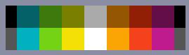
The three most obvious changes are:
- The color blue is missing (as in "deep blue")
- Yellow-orange has a sort of "gravity" that effects the other colors
- All of the colors are less saturated, giving them a "worn down" feeling
Now that we've updated 11 out of 16 colors, we've had to re-color 90% of the art assets, which is a big task that we're still working on. To test the new colors, I made a mock-up of the palettes side-by-side:

Because everything flows into each other, the new colors create an illusion of being "less colorful," which is good, but what's better is that it gives us a much bigger range of colors to use now that half of the colors aren't wasted!
We'll keep yall posted from now on whenever we make progress. Feel free to ask us questions.
--Matthew
Leave a comment
Log in with itch.io to leave a comment.